Highly Customizable Horizontally Swipe able Carousel Flutter Widget
.
flutter_cfalendar_carousel
Calendar widget for flutter that is swipe able horizontally. This widget can help you build your own calendar widget highly customizable. Now you can even add your icon for each event.
New Feature
[2.0.3]
- Multiple days selection using
addRangemethod #285 - Check out great feature
customDayBuilderwork done by maxgmer.
Rectangular style
Circular style
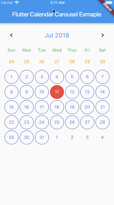
No border

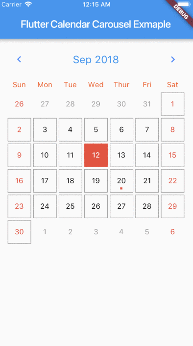
Marked Dates
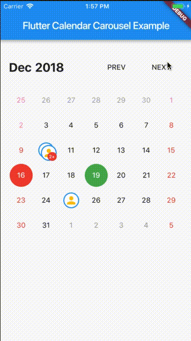
Custom Icon Events
Getting Started
For help getting started with Flutter, view our online documentation.
Properties
| properties | types | defaultValues |
|---|---|---|
| viewPortFraction | double | 1.0 |
| prevDaysTextStyle | TextStyle | |
| daysTextStyle | TextStyle | |
| nextDaysTextStyle | TextStyle | |
| prevMonthDayBorderColor | Color | Colors.transparent |
| thisMonthDayBorderColor | Color | Colors.transparent |
| nextMonthDayBorderColor | Color | Colors.transparent |
| dayPadding | double | 2.0 |
| height | double | double.infinity |
| width | double | double.infinity |
| todayTextStyle | TextStyle | fontSize: 14.0, color: Colors.white |
| dayButtonColor | Color | Colors.red |
| todayBorderColor | Color | Colors.red |
| todayButtonColor | Colors | Colors.red |
| selectedDateTime | DateTime | |
| selectedDayTextStyle | TextStyle | fontSize: 14.0, color: Colors.white |
| selectedDayBorderColor | Color | Colors.green |
| selectedDayButtonColor | Color | Colors.green |
| daysHaveCircularBorder | bool | |
| onDayPressed | Func | |
| weekdayTextStyle | TextStyle | fontSize: 14.0, color: Colors.deepOrange |
| iconColor | Color | Colors.blueAccent |
| headerTextStyle | TextStyle | fontSize: 20.0, color: Colors.blue |
| headerText | Text | Text('${DateFormat.yMMM().format(this._dates[1])}') |
| weekendTextStyle | TextStyle | fontSize: 14.0, color: Colors.pinkAccent |
| markedDatesMap | Events | null |
| markedDateWidget | Widget | Positioned(child: Container(color: Colors.blueAccent, height: 4.0, width: 4.0), bottom: 4.0, left: 18.0); |
| markedDateShowIcon | bool | false |
| markedDateIconBorderColor | Color | |
| markedDateIconMaxShown | int | 2 |
| markedDateIconMargin | double | 5.0 |
| markedDateIconBuilder | MarkedDateIconBuilder<T> | |
| markedDateIconOffset | double | 5.0 |
| markedDateCustomShapeBorder | ShapeBorder | null |
| markedDateCustomTextStyle | TextStyle | null |
| markedDateMoreCustomDecoration | Decoration | |
| markedDateMoreCustomTextStyle | TextStyle | |
| headerMargin | EdgetInsets | const EdgeInsets.symmetric(vertical: 16.0) |
| headerTitleTouchable | bool | false |
| onHeaderTitlePressed | Function | () => _selectDateFromPicker() |
| showHeader | bool | |
| showHeaderButton | bool | |
| childAspectRatio | double | 1.0 |
| weekDayMargin | EdgeInsets | const EdgeInsets.only(bottom: 4.0) |
| weekFormat | bool | false |
| locale | String | en |
| firstDayOfWeek | int | null |
| onCalendarChanged | Function(DateTime) | |
| minSelectedDate | DateTime | |
| maxSelectedDate | DateTime | |
| inactiveDaysTextStyle | TextStyle | |
| inactiveWeekendTextStyle | TextStyle | |
| weekDayFormat | WeekdayFormat | short |
| staticSixWeekFormat | bool | false |
| showOnlyCurrentMonthDate | bool | false |
| dayCrossAxisAlignment | CrossAxisAlignment | CrossAxisAlignment.center |
| dayMainAxisAlignment | MainAxisAlignment | CrossAlignment.center |
| showIconBehindDayText | bool | false |
| pageScrollPhysics | ScrollPhysics | ScrollPhysics |
With CalendarCarousel<YourEventClass> and EventList<YourEventClass> you can specifiy a custom Event class.
Install
Add flutter_calendar_carousel as a dependency in pubspec.yaml For help on adding as a dependency, view the documentation.
Usage
import 'package:flutter_calendar_carousel/flutter_calendar_carousel.dart' show CalendarCarousel;
Widget widget() {
  return Container(
    margin: EdgeInsets.symmetric(horizontal: 16.0),
    child: CalendarCarousel<Event>(
      onDayPressed: (DateTime date, List<Event> events) {
        this.setState(() => _currentDate = date);
      },
      weekendTextStyle: TextStyle(
        color: Colors.red,
      ),
      thisMonthDayBorderColor: Colors.grey,
//      weekDays: null, /// for pass null when you do not want to render weekDays
//      headerText: Container( /// Example for rendering custom header
//        child: Text('Custom Header'),
//      ),
      customDayBuilder: (   /// you can provide your own build function to make custom day containers
        bool isSelectable,
        int index,
        bool isSelectedDay,
        bool isToday,
        bool isPrevMonthDay,
        TextStyle textStyle,
        bool isNextMonthDay,
        bool isThisMonthDay,
        DateTime day,
      ) {
          /// If you return null, [CalendarCarousel] will build container for current [day] with default function.
          /// This way you can build custom containers for specific days only, leaving rest as default.

          // Example: every 15th of month, we have a flight, we can place an icon in the container like that:
          if (day.day == 15) {
            return Center(
              child: Icon(Icons.local_airport),
            );
          } else {
            return null;
          }
      },
      weekFormat: false,
      markedDatesMap: _markedDateMap,
      height: 420.0,
      selectedDateTime: _currentDate,
      daysHaveCircularBorder: false, /// null for not rendering any border, true for circular border, false for rectangular border
    ),
  );
}
Example
- main.dart
import 'package:flutter/material.dart';
import 'package:flutter_calendar_carousel/flutter_calendar_carousel.dart'
show CalendarCarousel;
import 'package:flutter_calendar_carousel/classes/event.dart';
import 'package:flutter_calendar_carousel/classes/event_list.dart';
import 'package:intl/intl.dart' show DateFormat;
void main() => runApp(new MyApp());
class MyApp extends StatelessWidget {
// This widget is the root of your application.
@override
Widget build(BuildContext context) {
return new MaterialApp(
title: 'dooboolab flutter calendar',
theme: new ThemeData(
// This is the theme of your application.
//
// Try running your application with "flutter run". You'll see the
// application has a blue toolbar. Then, without quitting the app, try
// changing the primarySwatch below to Colors.green and then invoke
// "hot reload" (press "r" in the console where you ran "flutter run",
// or press Run > Flutter Hot Reload in IntelliJ). Notice that the
// counter didn't reset back to zero; the application is not restarted.
primarySwatch: Colors.blue,
),
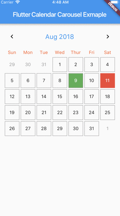
home: new MyHomePage(title: 'Flutter Calendar Carousel Example'),
);
}
}
class MyHomePage extends StatefulWidget {
MyHomePage({Key? key, required this.title}) : super(key: key);
// This widget is the home page of your application. It is stateful, meaning
// that it has a State object (defined below) that contains fields that affect
// how it looks.
// This class is the configuration for the state. It holds the values (in this
// case the title) provided by the parent (in this case the App widget) and
// used by the build method of the State. Fields in a Widget subclass are
// always marked "final".
final String title;
@override
_MyHomePageState createState() => new _MyHomePageState();
}
class _MyHomePageState extends State<MyHomePage> {
DateTime _currentDate = DateTime(2019, 2, 3);
DateTime _currentDate2 = DateTime(2019, 2, 3);
String _currentMonth = DateFormat.yMMM().format(DateTime(2019, 2, 3));
DateTime _targetDateTime = DateTime(2019, 2, 3);
// List<DateTime> _markedDate = [DateTime(2018, 9, 20), DateTime(2018, 10, 11)];
static Widget _eventIcon = new Container(
decoration: new BoxDecoration(
color: Colors.white,
borderRadius: BorderRadius.all(Radius.circular(1000)),
border: Border.all(color: Colors.blue, width: 2.0)),
child: new Icon(
Icons.person,
color: Colors.amber,
),
);
EventList<Event> _markedDateMap = new EventList<Event>(
events: {
new DateTime(2019, 2, 10): [
new Event(
date: new DateTime(2019, 2, 10),
title: 'Event 1',
icon: _eventIcon,
dot: Container(
margin: EdgeInsets.symmetric(horizontal: 1.0),
color: Colors.red,
height: 5.0,
width: 5.0,
),
),
new Event(
date: new DateTime(2019, 2, 10),
title: 'Event 2',
icon: _eventIcon,
),
new Event(
date: new DateTime(2019, 2, 10),
title: 'Event 3',
icon: _eventIcon,
),
],
},
);
@override
void initState() {
/// Add more events to _markedDateMap EventList
_markedDateMap.add(
new DateTime(2019, 2, 25),
new Event(
date: new DateTime(2019, 2, 25),
title: 'Event 5',
icon: _eventIcon,
));
_markedDateMap.add(
new DateTime(2019, 2, 10),
new Event(
date: new DateTime(2019, 2, 10),
title: 'Event 4',
icon: _eventIcon,
));
_markedDateMap.addAll(new DateTime(2019, 2, 11), [
new Event(
date: new DateTime(2019, 2, 11),
title: 'Event 1',
icon: _eventIcon,
),
new Event(
date: new DateTime(2019, 2, 11),
title: 'Event 2',
icon: _eventIcon,
),
new Event(
date: new DateTime(2019, 2, 11),
title: 'Event 3',
icon: _eventIcon,
),
]);
super.initState();
}
@override
Widget build(BuildContext context) {
/// Example with custom icon
final _calendarCarousel = CalendarCarousel<Event>(
onDayPressed: (date, events) {
this.setState(() => _currentDate = date);
events.forEach((event) => print(event.title));
},
weekendTextStyle: TextStyle(
color: Colors.red,
),
thisMonthDayBorderColor: Colors.grey,
// weekDays: null, /// for pass null when you do not want to render weekDays
headerText: 'Custom Header',
weekFormat: true,
markedDatesMap: _markedDateMap,
height: 200.0,
selectedDateTime: _currentDate2,
showIconBehindDayText: true,
// daysHaveCircularBorder: false, /// null for not rendering any border, true for circular border, false for rectangular border
customGridViewPhysics: NeverScrollableScrollPhysics(),
markedDateShowIcon: true,
markedDateIconMaxShown: 2,
selectedDayTextStyle: TextStyle(
color: Colors.yellow,
),
todayTextStyle: TextStyle(
color: Colors.blue,
),
markedDateIconBuilder: (event) {
return event.icon ?? Icon(Icons.help_outline);
},
minSelectedDate: _currentDate.subtract(Duration(days: 360)),
maxSelectedDate: _currentDate.add(Duration(days: 360)),
todayButtonColor: Colors.transparent,
todayBorderColor: Colors.green,
markedDateMoreShowTotal:
true, // null for not showing hidden events indicator
// markedDateIconMargin: 9,
// markedDateIconOffset: 3,
);
/// Example Calendar Carousel without header and custom prev & next button
final _calendarCarouselNoHeader = CalendarCarousel<Event>(
todayBorderColor: Colors.green,
onDayPressed: (date, events) {
this.setState(() => _currentDate2 = date);
events.forEach((event) => print(event.title));
},
daysHaveCircularBorder: true,
showOnlyCurrentMonthDate: false,
weekendTextStyle: TextStyle(
color: Colors.red,
),
thisMonthDayBorderColor: Colors.grey,
weekFormat: false,
// firstDayOfWeek: 4,
markedDatesMap: _markedDateMap,
height: 420.0,
selectedDateTime: _currentDate2,
targetDateTime: _targetDateTime,
customGridViewPhysics: NeverScrollableScrollPhysics(),
markedDateCustomShapeBorder:
CircleBorder(side: BorderSide(color: Colors.yellow)),
markedDateCustomTextStyle: TextStyle(
fontSize: 18,
color: Colors.blue,
),
showHeader: false,
todayTextStyle: TextStyle(
color: Colors.blue,
),
// markedDateShowIcon: true,
// markedDateIconMaxShown: 2,
// markedDateIconBuilder: (event) {
// return event.icon;
// },
// markedDateMoreShowTotal:
// true,
todayButtonColor: Colors.yellow,
selectedDayTextStyle: TextStyle(
color: Colors.yellow,
),
minSelectedDate: _currentDate.subtract(Duration(days: 360)),
maxSelectedDate: _currentDate.add(Duration(days: 360)),
prevDaysTextStyle: TextStyle(
fontSize: 16,
color: Colors.pinkAccent,
),
inactiveDaysTextStyle: TextStyle(
color: Colors.tealAccent,
fontSize: 16,
),
onCalendarChanged: (DateTime date) {
this.setState(() {
_targetDateTime = date;
_currentMonth = DateFormat.yMMM().format(_targetDateTime);
});
},
onDayLongPressed: (DateTime date) {
print('long pressed date $date');
},
);
return new Scaffold(
appBar: new AppBar(
title: new Text(widget.title),
),
body: SingleChildScrollView(
child: Column(
crossAxisAlignment: CrossAxisAlignment.start,
mainAxisAlignment: MainAxisAlignment.start,
children: <Widget>[
//custom icon
Container(
margin: EdgeInsets.symmetric(horizontal: 16.0),
child: _calendarCarousel,
), // This trailing comma makes auto-formatting nicer for build methods.
//custom icon without header
Container(
margin: EdgeInsets.only(
top: 30.0,
bottom: 16.0,
left: 16.0,
right: 16.0,
),
child: new Row(
children: <Widget>[
Expanded(
child: Text(
_currentMonth,
style: TextStyle(
fontWeight: FontWeight.bold,
fontSize: 24.0,
),
)),
FlatButton(
child: Text('PREV'),
onPressed: () {
setState(() {
_targetDateTime = DateTime(
_targetDateTime.year, _targetDateTime.month - 1);
_currentMonth =
DateFormat.yMMM().format(_targetDateTime);
});
},
),
FlatButton(
child: Text('NEXT'),
onPressed: () {
setState(() {
_targetDateTime = DateTime(
_targetDateTime.year, _targetDateTime.month + 1);
_currentMonth =
DateFormat.yMMM().format(_targetDateTime);
});
},
)
],
),
),
Container(
margin: EdgeInsets.symmetric(horizontal: 16.0),
child: _calendarCarouselNoHeader,
), //
],
),
));
}
}GitHub
Source Code: Highly Customizable Horizontally Swipe able Carousel Flutter Widget.