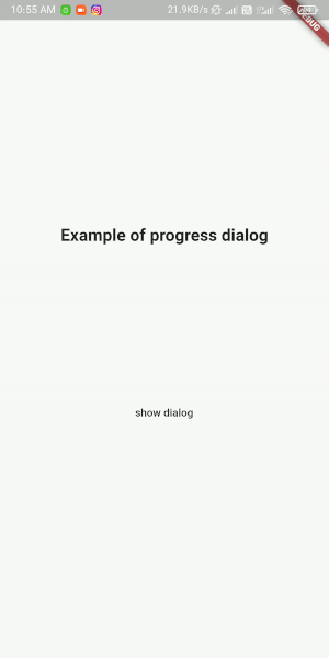
Custom-built progress dialog for Flutter with smooth animation
Packages in flutter are the things which allows us to create new things. This is a light weight flutter package to show progress dialog. As it is a stateful widget, you can change the text shown on the dialog dynamically.
ars_progress_dialog
Customizable progress dialog for Flutter applications with smooth animation for background dim color and blur.
Getting Started
Install
Get it from pub.dev. The same way as the animation widget we talked about in: A complete animation widget for rotation with flutter.
Add dependency to pubspec.yaml file :ars_progress_dialog: 0.0.1
Run this command :$ flutter pub get
Import
Import class in your project :import 'package:ars_progress_dialog/ars_progress_dialog.dart';
Showing Dialog
Show simple progress dialog :
ArsProgressDialog progressDialog = ArsProgressDialog(
	context,
	blur: 2,
	backgroundColor: Color(0x33000000),
	animationDuration: Duration(milliseconds: 500));

	progressDialog.show(); // show dialog
	progressDialog.dismiss(); //close dialog
Customize loading widget :
 ArsProgressDialog customProgressDialog = ArsProgressDialog(
	 context,
	 blur: 2,
	 backgroundColor: Color(0x33000000),
	 loadingWidget: Container(
		 width: 150,
		 height: 150,
		 color: Colors.red,
		 child: CircularProgressIndicator(),
    ));
Properties
| Name | Type | Description | Default |
|---|---|---|---|
| backgroundColor | Color | Dialog dim(background) Color | Color (0x99000000) |
| blur | double | Blur amount of dialog background | 0 |
| dismissable | bool | Setting this true lets user dismiss dialog by touching outside of it. | true |
| onDismiss | Function | This function triggers when user dismisses dialog. | – |
| loadingWidget | Widget | Dialog’s widget. You can use your own widget when showing dialog. | simple widget |
| useSafeArea | bool | Setting this to false makes dialog background fullscreen but when you set it true blur and background color will not apply on status bar, navigation bar and … | false |
| animationDuration | Duration | This duration defines how much will take for blur and background color to appear. | Duration (milliseconds : 300) |
**Note**– Recently this package has been discontinued.