Nepal over last Four Decades with R
The World Bank DataBank provides the data of all countries for more than 1000 indicators since 1960. It can be used for various statistical analysis purpose. This weekend, I downloaded the Data for Nepal, and tried few simple things in R, mainly for the purpose of learning R. R is very powerful statistical analysis tool.
The data was downloaded as csv file, which can be read with read.csv() function in R. We can run the R commands from R command line, and its really interactive.
> # read the data from csv file into dataframe
> nep <- read.csv('nepal.csv')
The data is loaded by default into R DataFrames. To keep things simple, i change the default indices of DataFrames to Years.
> # set the row index by Years
> rownames(nep) <- nep$Year
> nep$Year<-NULL
Now we have DataFrame ready with Nepal’s Data over last 4 decades (1960 to 2012 to be precise), which can be analyzed and Visualized.
Let us see the USD (US Dollar) vs NRS (Nepalese Rupees) Trend. The plot can be generated and saved to disk with following commands.
> png(filename = 'NRS Vs USD Trend.png')
> plot(rownames(nep), nep$Official.exchange.rate.LCU.per.USD, col="blue", lwd = 3,  type = "o", xlab = "Year", ylab = "NRS per USD", main = "NRS Vs USD Trend")
>
> dev.off()
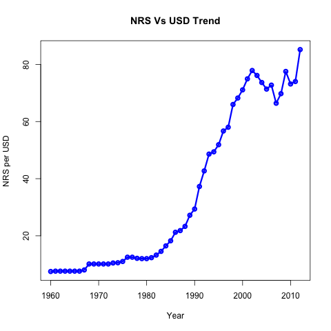 |
| NRS Vs USD Trend |
Similarly we can generate plots for other indicators too. For that we can don matlab-like subplot with par function. Let us see few other Indicators’ trend.
> png(filename = 'various.png')
> op <- par(mfcol=c(2,2))
> plot(rownames(nep), nep$GDP.per.capita, col="green", lwd = 3,  type = "o", xlab = "Year", ylab = "GDP per capita (USD)", main = "GDP Per capita (USD)")
> plot(rownames(nep), nep$Life.expectancy, col="red", lwd = 2,  type = "l", xlab = "Year", ylab = "Life Expectency (In Years)", main = "Life Expectency trend")
> plot(rownames(nep), nep$Cereal.yield..kg.per.hectare., col="blue", lwd = 2,  type = "l", xlab = "Year", ylab = "Cereal Production (kg per hectare)", main = "Cereal production Capacity")
> plot(rownames(nep), nep$Electric.power.transmission.and.distribution.losses....of.output., col="blue", lwd = 2,  type = "l", xlab = "Year", ylab = "Electricity Distribution Losses (% of total)", main = "Electricity Distribution Losses")
> dev.off()
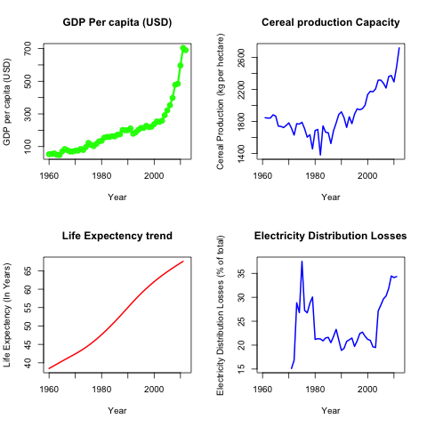 | |||||
| Trend of Various Indicators in Nepal |
Till now we have just visualized the data available. Now let me do first analysis. For that I am computing CPI (Consumer price Index) from Inflation on Consumer Prices and see GDP per capita is doing good against it. (note that CPI indicator is already provided by databank). And, I’m doing this by writing my first script.
# cpi.R
# read the data from csv file into dataframe
nep<-read.csv('nepal.csv')
# set the row index by Years
rownames(nep)<-nep$Year
nep$Year<-NULL
# Extract rows of concern, The inflation and GDP.per.capita
mydf <- data.frame(nep[c('Inflation.on.Consumer.price',
                         'GDP.per.capita')], rows = rownames(nep))
# since Inflation is not available for first fer years, let me just filter out them
mydf <- tail(mydf, -sum(is.na(mydf$Inflation.on.Consumer.price)) + 1)
# To check if GDP per capita is really doing good against CPI,
# let me set the CPI of first yera to the GDP per_capita
starter = mydf$GDP.per.capita[1]
mydf$Inflation.on.Consumer.price[is.na(mydf$Inflation.on.Consumer.price)] <- 0
# Computation of CPI
# can be done by loop, but i'm using built in cumprod,
# and insterting the result into same dataframe
mydf <- within(mydf, CPI <- starter * cumprod(1 + mydf$Inflation.on.Consumer.price/ 100))

# plotting the result
png(filename = 'Inflation_and_cpi.png')
op <- par(mfcol = c(2, 1))
plot(rownames(mydf), mydf$Inflation.on.Consumer.price, type = 'o',
     col = 2, xlab = "Years", ylab = "Inflation on Consumer Price",
     main = "Consumer Price Index of Nepal")
axis(2, col.axis = "red")

# The average inflation rate is Geometric mean, not Arithmetic mean
avg  <- (mydf$CPI[nrow(mydf)] / starter) ^ (1 / nrow(mydf)) * 100 - 100
par(new = T)
abline(h = avg, col = 3)
legend("bottomright",col=c(2, 3),lwd = 2,
       legend=c("Inflation","Avg. Inflation"), cex = 0.75)

# The second plot of CPI, and GDP per capita
plot(rownames(mydf), mydf\$CPI, ylim=range(c(mydf$CPI,mydf$GDP.per.capita)),
     type = 'l', col = 4, ylab = "CPI", xlab = "Year",
     main ="CPI and GDP per Capita Trend")
par(new = TRUE)

plot(rownames(mydf), mydf$GDP.per.capita, ylim=range(c(mydf$CPI,mydf$GDP.per.capita)),
     type = 'l', col = 6, xaxt="n", ann = F)
axis(4, col.axis = 3)
mtext("GDP per capita",side=4,line=3)
legend("topleft",col=c(4, 6),lwd = 2,
       legend=c("CPI","GDP per capita"), cex = 0.75)
dev.off()
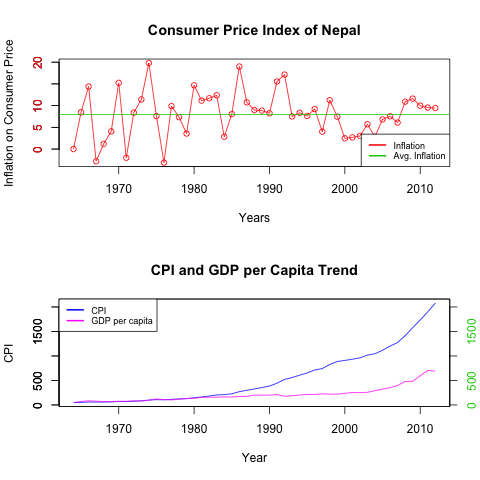 |
| Inflation, CPI and GDP per Capita of Nepal |
There are many things we can see from this analysis.
- The Inflation (average) is Quite High : about 8%… That is twice the average Inflation of US.
- The Inflation Rates increases during political crisis, and after political change.
- CPI indicate the purchasing power of money at that particular time. So, anything that cost Rs 100 at 1974, would be expecting to cost about Rs 2080 in 2012. That’s quite high Inflation. As far as i know, I think US CPI has become just 5 times in this period.
- Our GDP per capita is doing very bad comparing to CPI. So, from our analysis, we can see that till early 80’s, we have CPI around GDP per capita (if we start from CPI = GDP per capita in 1964), But after that things turn worse, probably due to political instability.
There are many such things that we can visualize, and understand from this data.
Now, let me build my first linear model (linear regression). If we go through data, we can probably think that Life expectancy is related to crude birth rate, crude death rate and fertility rate.
We can build our model with:
> fit <- lm(nep$Life.expectancy ~ nep$CBR + nep$CDR + nep$Fertility.rate)
To view the summary of our fit:
> summary(fit)
Call:
lm(formula = nep$Life.expectancy ~ nep$CBR + nep$CDR + nep$Fertility.rate)
Residuals:
Min       1Q   Median       3Q      Max
-0.14416 -0.04810 -0.01322  0.05591  0.10369
Coefficients:
                   Estimate Std. Error  t value Pr(>|t|)
(Intercept)        80.670924   0.193558  416.779   <2e-16 ***
nep$CBR             0.058031   0.019819    2.928   0.0052 **
nep$CDR            -1.263016   0.003453 -365.777   <2e-16 ***
nep$Fertility.rate -2.341887   0.112494  -20.818   <2e-16 ***
---
Signif. codes:  0 '***' 0.001 '**' 0.01 '*' 0.05 '.' 0.1 ' ' 1
Residual standard error: 0.06112 on 48 degrees of freedom
(1 observation deleted due to missingness)
Multiple R-squared:      1,    Adjusted R-squared:      1
F-statistic: 4.019e+05 on 3 and 48 DF,  p-value: < 2.2e-16
We can see that, our model has fitted well with very low p values. To see the confidence intervals of our model:
> confint(fit)
2.5 % 97.5 % (Intercept) 80.28174868 81.06009844 nep$CBR 0.01818307 0.09787869 nep$CDR -1.26995822 -1.25607289 nep$Fertility.rate -2.56807119 -2.11570372
To see how well our model has fit :
> par(new = T)
> plot(nep$Life.expectancy, type = 'l', col = 3, xaxt = "n", yaxt = "n", ann = F)
> legend("topleft", col = c(1, 3), lwd = 2, legend = c("fitted", "Original"), cex = 0.8)
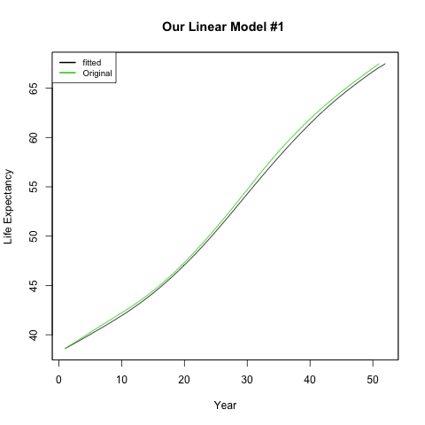 | ||||
| Our multiple linear model |
There are many other such analysis we can do, much more powerful than these with R.
